Archive Dive – Glastonbury 2023

With Glastonbury back on this weekend, for my first proper post I thought I’d revisit the advertising campaign I worked on for last year’s festival with BBC Creative, via Central Illustration agency. If you’re reading this, thank you! It’s early days, but I hope you both enjoy it/hello Mum, and so on. Please consider subscribing if you haven’t already – my plan is to use this space to take occasional deeper dives into my work, such as this opening salvo is about to, to share news of upcoming print releases, and we’ll just have to see what else. Right, here goes something…
When my excellent agent Jules from Central Illustration called me to say that BBC Creative wanted to commission me to illustrate three billboards featuring artists set to headline the Pyramid Stage, once I’d checked I wasn’t waking from a bizarre fever-dream in a tent on a festival campsite somewhere, my heart (and mind) started racing. Something like this is the kind of project you always hope to do, but isn’t one that you can be sure will ever come your way either, so you almost don’t dare to dream of it happening either. Having been *this close* on some big projects before, I know it’s crucial to keep a lid on the excitement, or at least try to, until that all-important purchase order has been received. That said, I had a good feeling about it, mostly because the BBC had asked for me directly, and as far as we knew, there didn’t seem to be a shortlist of artists represented elsewhere in the mix. But I’ve been wrong about that before too.
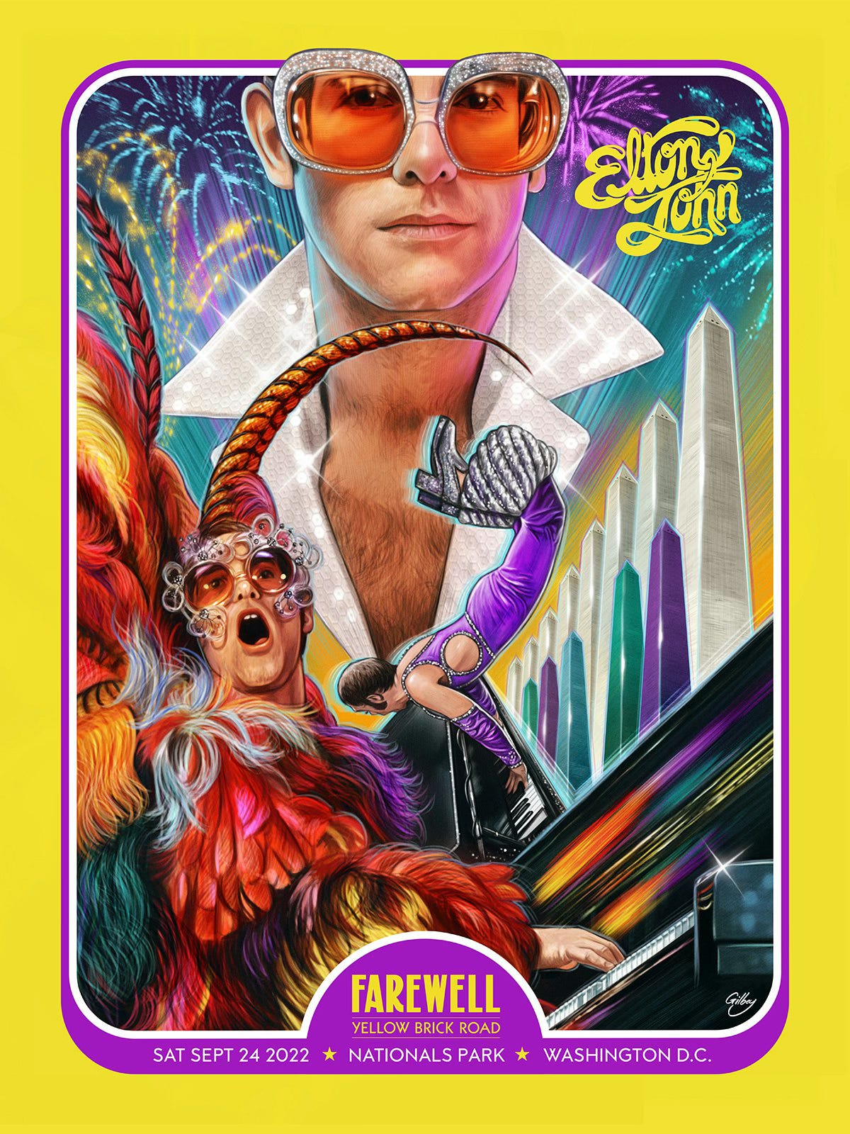
Slight tangent: Why did the BBC want me? Well I can’t be sure exactly, but I do know that the poster I did with Collectionzz the year before for Elton John’s Farewell Tour certainly didn’t hurt my chances. Normally when you’re in with a shout of being picked by an agency, they’ll have 2-3 examples of your work in a document, and it’s always very useful to know what they’ve been particularly drawn to. I’ll tell you more about that (also great) project another time perhaps, but I always say that everything you’ve ever done is out there silently waiting to catch the eye of a potential client, so you never know what might lead to something else one day, often/always when you least expect it.
Anyway, it turned out that it was very much real, it was happening, and the brief was to illustrate the three acts as larger than life musical heroes befitting their Pyramid stage headlining status, and also trying to explore ways to integrate them compositionally with said iconic stage.
I believe that the initial enquiry came in early May (don’t quote me, it may have been late April), so with the festival coming up in late June, it was about putting the excitement aside (as much as possible) and getting to the (literal) drawing board as quickly as possible. Early meetings with the BBC team were conducted over video chat, and went great if I may say so myself, with the team clearly sharing mine and Jules’ excitement and enthusiasm, as well as the pressing nature of the task at hand. Getting straight down to it, we quickly agreed on the idea that the stage and the crowd would be shared as much as possible across the set in terms of scale and position (albeit with the palette of the sky changing for each piece to create a different mood and customized where appropriate), thereby leveraging the maximum amount of time I had to work on each individual artist’s poster.
The BBC were able to send plenty of high quality reference of the stage and crowds, so I set to work on making the overall template of the stage and screens, the crowd, Glastonbury Tor, tents and flags for the backgrounds – gradually piecing everything together as a collage initially, and then redrawing and stylizing it. I knew that this was going to set the foundation for everything else, even though of course viewers aren’t really going to ‘see’ all that work, at first glance at least, because hopefully if I do the rest of the job correctly, they’ll be drawn immediately to the artists, then the messaging, before spotting some of the finer details.
At this point I was of course excited to get onto the main portrait painting, but it was also a great feeling to have this foundation in place. I don’t always work in that way, but it made sense on this occasion, not least because the BBC needed to receive the pieces one at a time, to be able to get their work started on the type and branding proper. One thing we ultimately omitted were flags and signs in the crowd. Early on in the process I was including them, because it just made sense conceptually, but ultimately they were cutting the flow of the wide horizontal compositions up too much, and proving to be more of a distraction. Again it came back to the idea that you just need to know that the crowd is there, and they shouldn’t be competing for attention with either the Pyramid stage or the acts. Creating artwork can be a bit like editing a movie in that sense – you might start out thinking that this particular element (or scene) you loved from an early draft is going to be essential, but in the end there can be a more efficient way to tell the story.
A similar process was used to plan the acts, combining various references for the performers in terms of their facial expressions, clothing and poses. Of course one of the pitfalls here was that we didn’t know what they’d all be wearing for their performances, and the ads were going to be used both just before the festival, and shown for a few weeks afterwards, so it was about picking something that felt ‘on brand’ for each performer without being something that would stand out as such, to only be obviously wrong the moment they’d stepped on stage.
In normal circumstances I would have done a rough sketch at this point, but to maximize the painting time, and with the client being familiar with my work, we were able to agree on some rough Photoshopped composites with some rough illustrated embellishments here and there. I’ll always go as far with my roughs as a client wants of course, but the BBC Creative team were really great at freeing me up to get onto the actual work, so I really appreciated their trust in that regard.
Slight tangent: The side story to this is that this overlapped with an advertising project I had started just a few weeks earlier with Channel 4, which I may well explore next. To say it was an intense period is a bit of an understatement, but despite the effort required, it’s a time that I can look back on now with both fondness and a sense of pride. Plus I often find that however busy you are on a project, having another one (or more) to switch to and from can really help each to develop, because you’re taking a break and coming back to it fresh. The fact that your ‘break’ is drawing something else might not be sustainable long term, but it can totally work if you’re disciplined and focused. I’ll go into my routine at some point on here too perhaps. In any case, it was very surreal (and awesome) to see both campaigns up on digital billboards around the U.K. at the same time, sometimes rolling together on the actual same screen. I doubt I’ll ever have that experience again, in fact, but I’m very grateful that it happened just once.
Poster 1: I Bet You Look Good on a Billboard

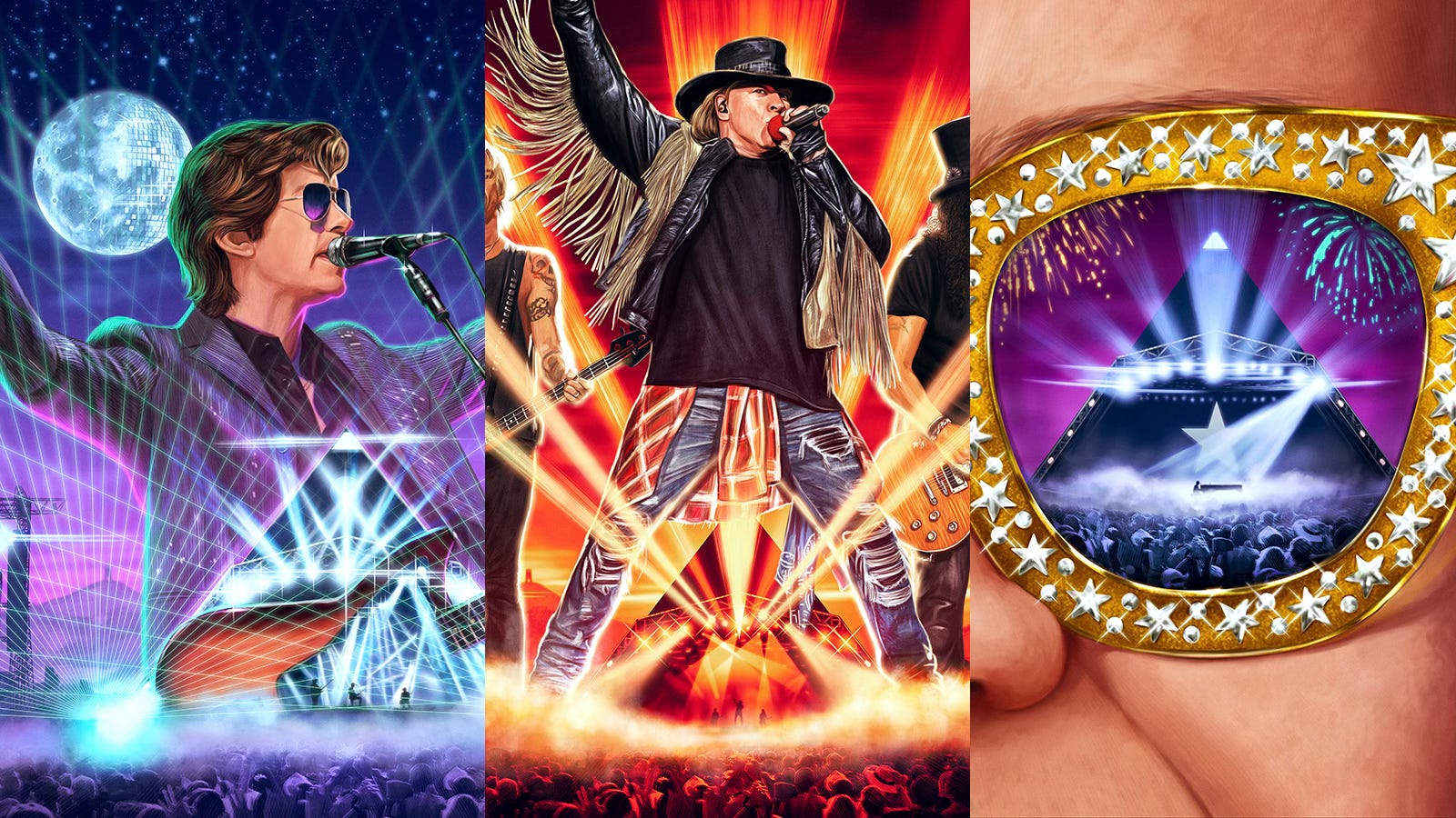
The process for creating each piece was fairly straightforward, as it should be once you’ve agreed with a client on what you’re doing. With Arctic Monkeys, I loved discovering how Alex Turner’s pose in general, and his guitar strap in particular, perfectly complemented the angle of the pyramid. We’d agreed on a night theme for this one, so having the moon as a mirrorball, referencing one of their recent songs, just felt too perfect not to do. Then the final touch was having a grid of lasers emanating out from the stage, echoing the pinstripes on Turner’s suit and also complementing his outstretched arms, inviting the crowd to sing along.
Poster 2: I’m Still Standing/Painting
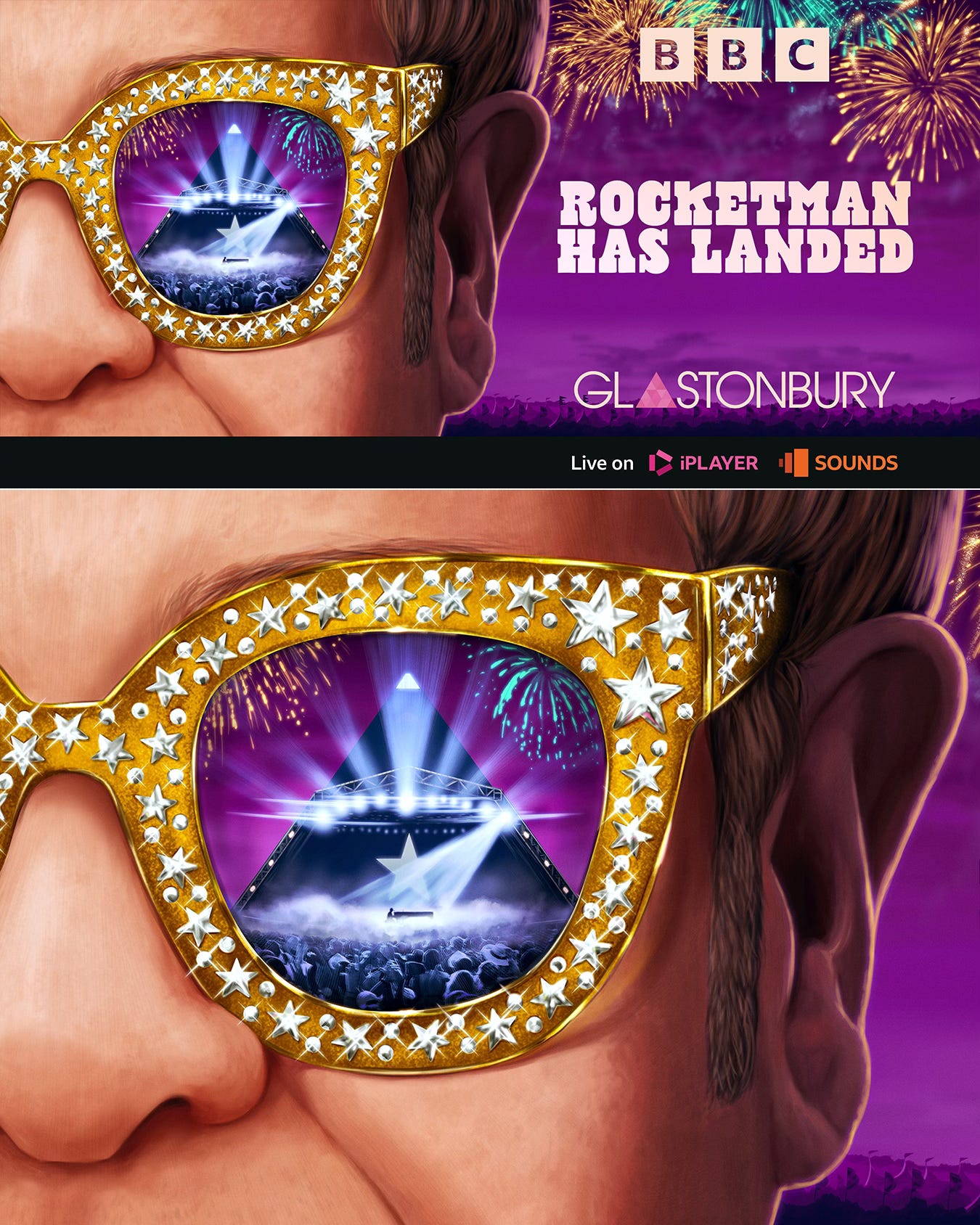
For Sir Elton John, focusing on his iconic glasses just felt like the way to go, and with this set to be his last ever UK concert, as well as the closing Pyramid stage performance on the Sunday night, it needed to be both celebratory, but also highlighting that significant moment. The purple sky complementing the gold helped to give it that sense of ‘pop royalty’, with the fireworks indicating the celebrations, and the lone Elton on the piano as the ‘reflection’ in his glasses hopefully offering a more poignant angle on the proceedings.
Poster 3: Guns N’ Roses N’ Deadlines
I remember having to work on this one especially over a couple of weekends as the festival was drawing ever closer. I listen to BBC 6Music every day (the excellent Lauren Laverne breakfast show in particular), and it was strange to hear the increasingly frequent mentions and trailers for Glastonbury as the days and weeks went on, and be sharing in that sense of growing excitement on one hand, whilst also feeling the stress levels increase in tandem, as my deadline was of course inextricably linked to that!
For this one it was great to go for the heat of the reds and oranges of a particularly intense sunset, and illustrating both Slash and Duff McKagan along with Axl Rose just had to be done. Axl stands astride the stage, his stance a perfect complement to the sides of the Pyramid stage, as light rays beam out into the darkening red sky as the power of rock takes over. Or something.

So there you have it pretty much. It was great to see the lovely work that the BBC Creative team did with the type and messaging for each poster. Thanks to them for entrusting me with this dream project in the first place, for all their support making it happen, and to Jules at Central Illustration for all the support throughout this (and the Channel 4 project). Thanks also to everyone who sent me photos when they saw the billboards somewhere near them.
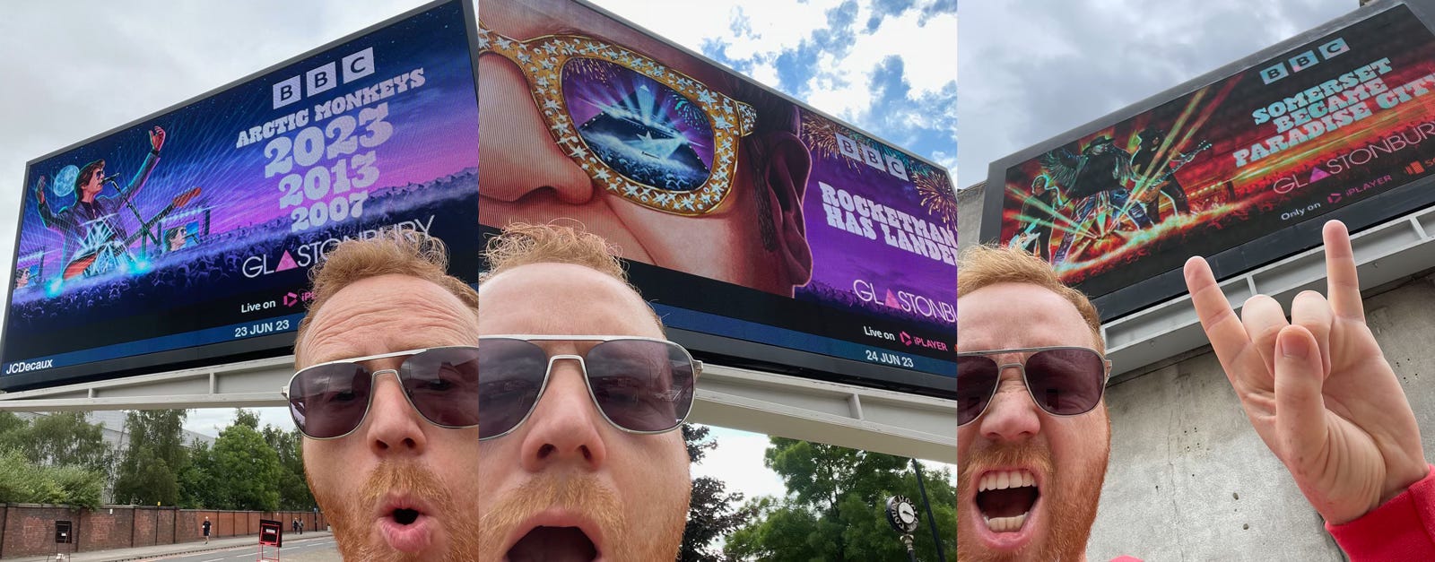
It was pretty intense at times, I can’t lie, but I’ll never forget the feeling of seeing it up on billboards for the first time, and knowing that was going to happen kept me laser-focused throughout.
I’ll also never forget the slight panic I felt trying to actually find them! I was up in Sheffield for Vice Press Open House the Friday of Glastonbury when they first went up, and the BBC had been able to provide a list of roads where they were on display, but not actual postcodes. It turns out that roads in cities can be quite long when you’re desperate to get some timely social media posted (!), but thankfully there ended up being one a mere 5-10 minute walk from the hotel I was staying in.
Arctic Monkeys had gone up on the Friday, and then Elton John appeared on the Saturday morning, so I remember feeling like a bit of a weirdo getting ready to take selfies in front of quickly rotating advertisements, as city traffic sped past on either side of the Sheffield advertising island I had seemingly started to frequent. But not so much that it stopped my doing the exact same thing outside Lambeth North Underground station a week or so later, to see the Guns N’ Roses one, as well as the Channel 4 ads on rotation. I’d do it again if I ever get the chance, let me tell you.
Thanks for reading this, if indeed you still are. Hello again Mum. See you on Monday for a cup of tea and a biscuit. They’d better not just be Rich Teas.