


Archive Dive – Channel 4

After looking back at the BBC Glastonbury project for my first proper post a couple of weeks back, it made sense to rewind to just a little bit earlier last year to the (to be fair equally exciting) project that ended up overlapping with it, not least because there are quite a few parallels.
As per Glasto with BBC Creative, 4creative had also reached out to Central Illustration and asked for my availability specifically. This is rarely the case, in my experience anyway (!), as you tend to be in the mix with other artists from your own agency, and often with artists from other agencies too. To put it another way, it’s a very nice feeling when you can skip that nervous stage!
Also like the aforementioned festival project (have I mentioned that I did some artwork for Glastonbury?!), this was set to be a billboard campaign, with a respected national broadcaster, which would be seen all over the UK during summer for a few weeks. A pinch myself moment if ever there was one.
Naturally I immediately agreed to the project, knowing that with larger gigs like this, there tends to be a bit of lead time, so I cracked on trying to finish whatever else I could while the plans and details coalesced. Little did I know that before I had finished the project, the BBC would also be commissioning me to create the Glastonbury artwork – another ‘must do’ project. Time for another pinch.
Slight tangent: I don’t mean to get (too) pretentious already, but when I get into super busy periods like this, I often think of the phrase coined by Billie Jean King, that “pressure is a privilege”. Then I stop daydreaming about interesting/wise quotes and get down to work because, as fans of The Bear know “every second counts”. Oh man, I did it again, didn’t I.
How it Began/How it Finished
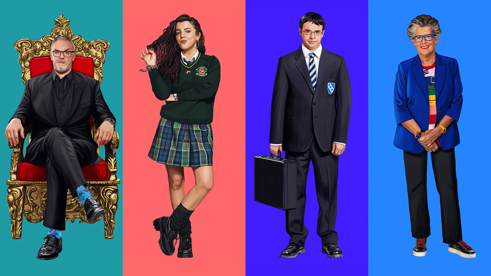
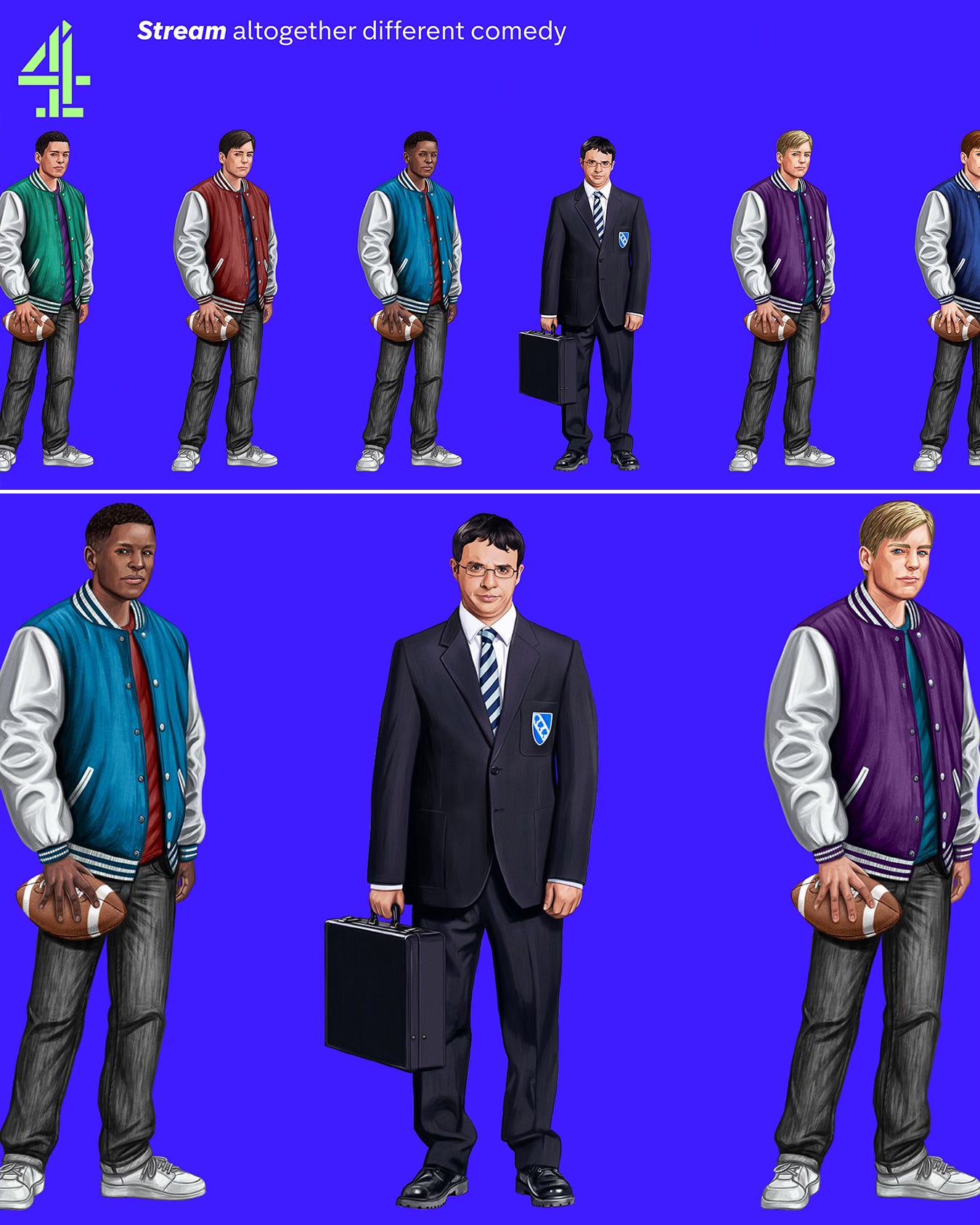
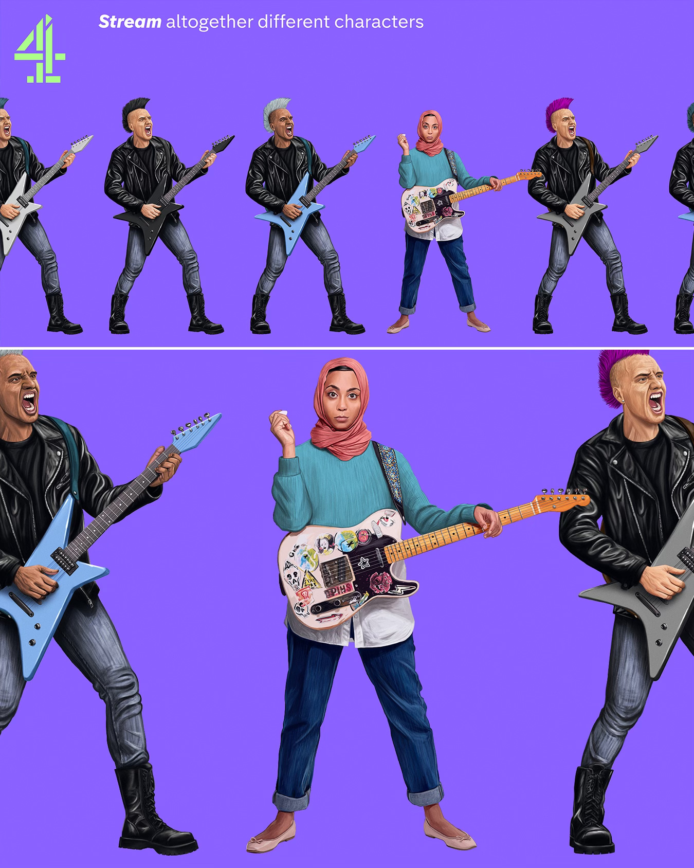
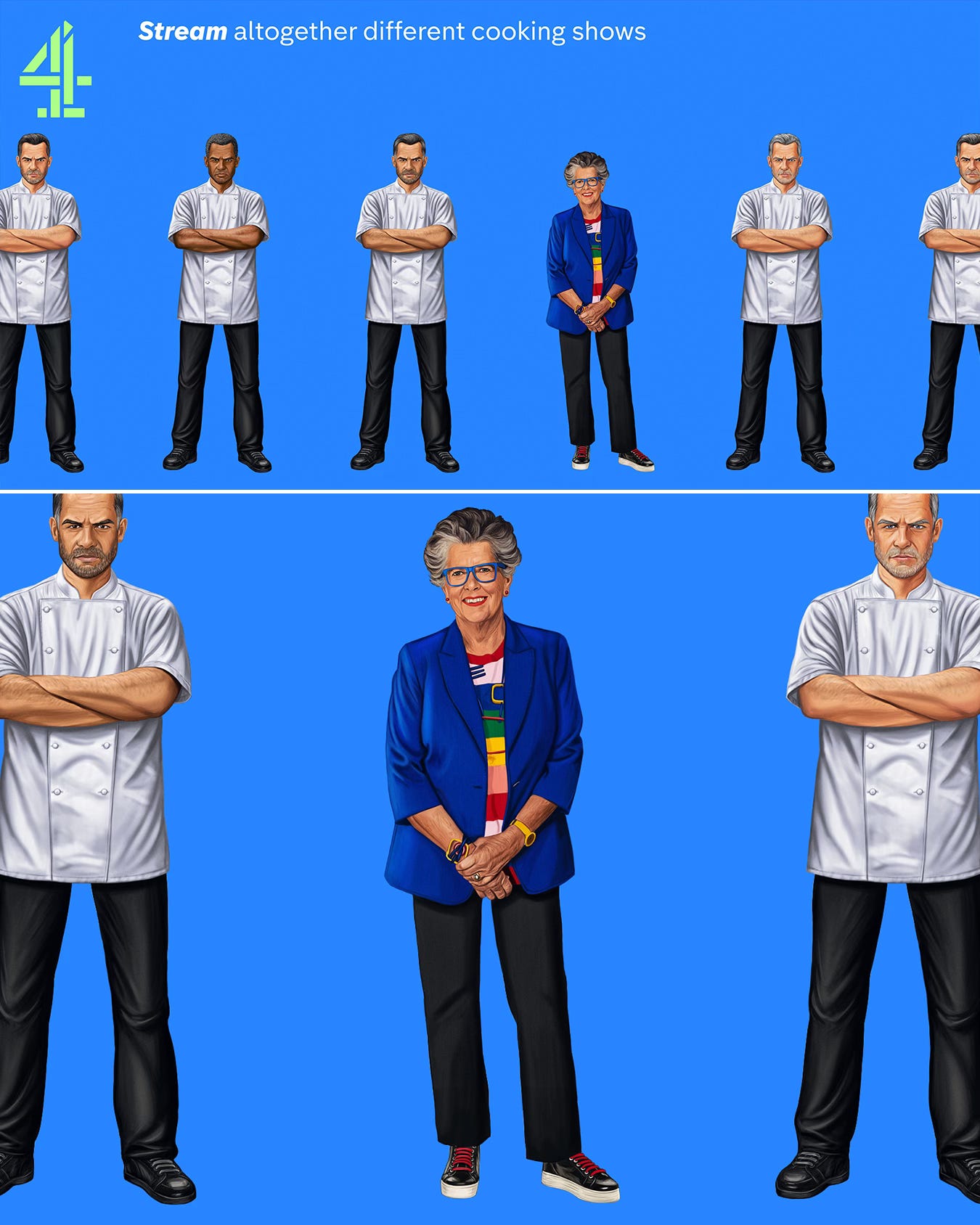
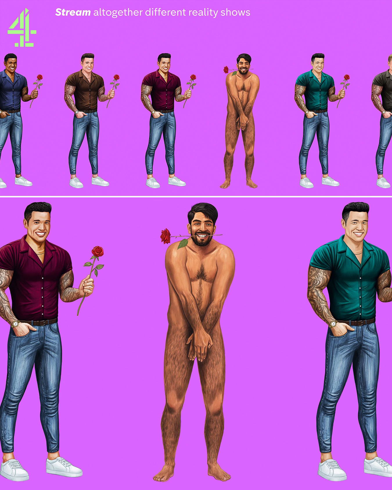
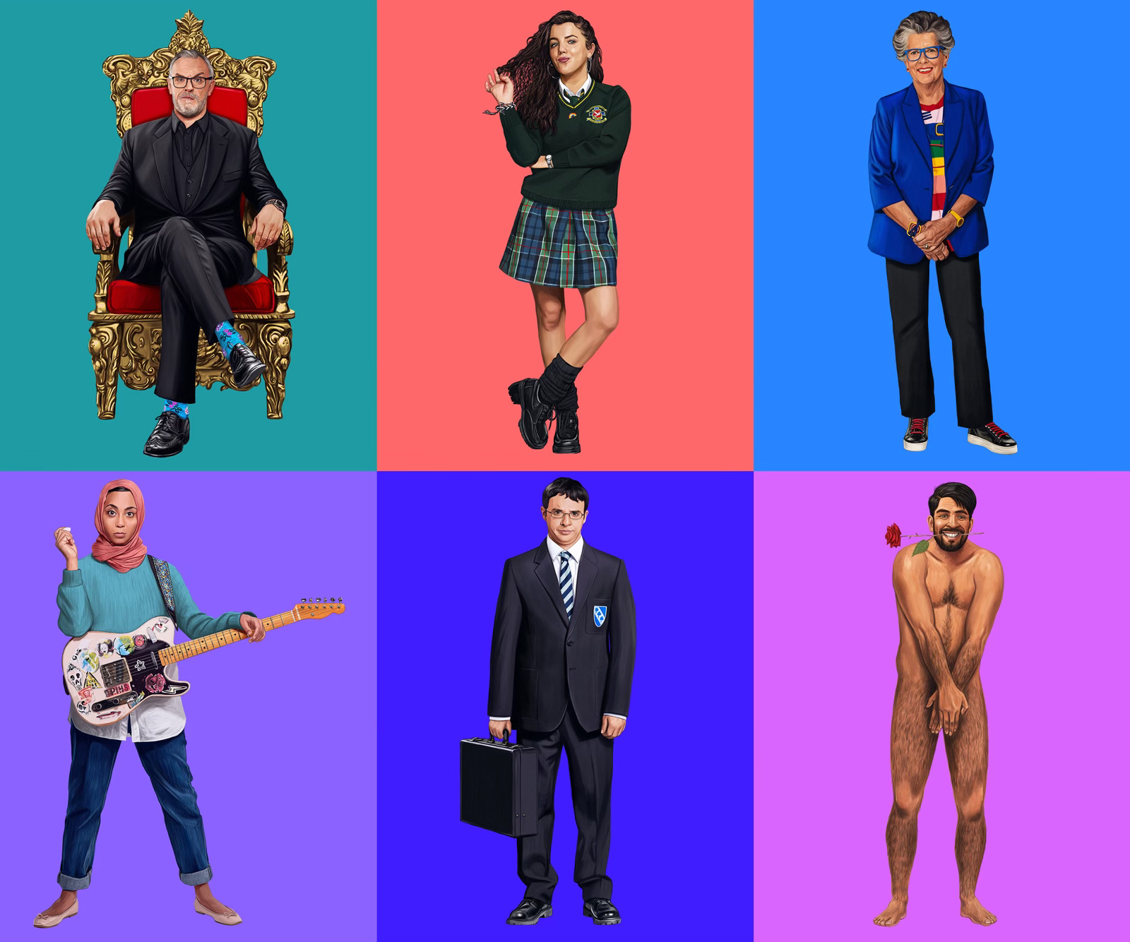
Anyway, Channel 4 were running a brand refresh campaign around the tagline of ‘Altogether Different’, highlighting what makes their shows unique. The brief was to illustrate characters from iconic Channel 4 shows, and have said characters stand out from a row (think ‘line-up’) of near identical ‘clones’ which implicitly could have been lifted from the shows of rival broadcasters and streaming services.
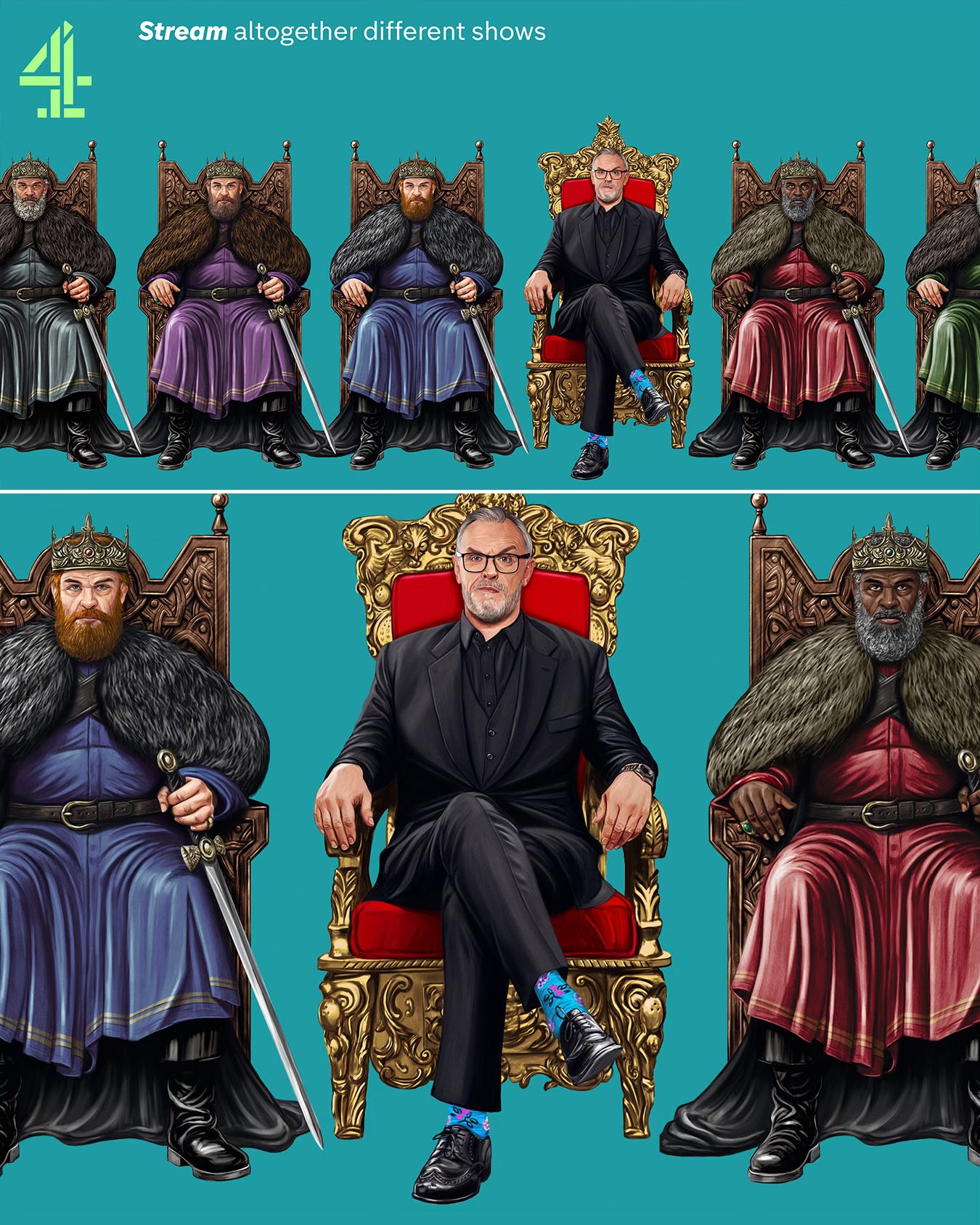
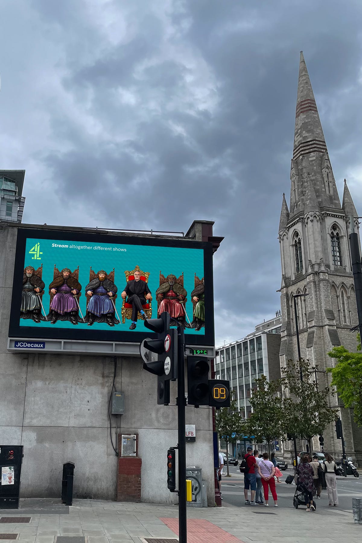
What I especially loved about the concept was how it played with genre – for instance with Greg Davies glowering down from his Taskmaster throne, and rather than being flanked by other gameshow hosts, instead he contrasts with a row of seated medieval kings who could be characters from ‘Game of Clones’ shows.
Will from The Inbetweeners and Michelle from Derry Girls catch the eye in their school uniforms against an army of ‘uniform’ jocks and cheerleaders, and Amina from We Are Lady Parts stares us down cooly whilst a band or two’s worth of not-so-unique punks play and shout the same old same old, all vying for our attention and failing miserably.

Pru Leith from Great British Bake Off in her colourful clothing and with her friendly demeanor is instantly more appealing than the ranks of serious male chefs around her glaring back at us, and amongst a sea of cookie-cutter lads from dating shows, a cheeky contestant from Naked Attraction can’t help but catch the eye.
Process Makes Perfect
In terms of process, with each of the 6 posters I worked on the Channel 4 character first. In some cases I had a direct reference I could work from, whilst in others it was a case of first making a composite from separate elements, such as a facial expression from here, a torso from there, the rest of the figure from a wide shot, some references of myself or my wife, and so on. As with all my work, the characters were then painted in detail by hand in Photoshop on my Wacom Cintiq 24HD, via my iMac Pro (I’ve since upgraded to a Mac Studio).
I then created the clones, like some kind of artistic Dr. Frankenstein, albeit hopefully without too much maniacal laughter, and as far as I can remember at least, without a lightning storm raging against a full moon outside. It hugely helped having the ‘real’ people already painted, because I could then create the first clone alongside them and treat them as a pair.
I assembled lots of reference as you might imagine, for faces, hairstyles, outfits and so on, and it was a really interesting process making something (sorry, someone) brand new. Naturally the research phase for each poster was also created in collaboration with the client, because with 6 posters to make, it was crucial to make the painting process as efficient as possible, by agreeing on reasonably detailed pencil sketches which established all the key elements of each character first. 4creative were super helpful at every stage. I like to provide regular updates on progress and bring the client/s into the process as much as I can, because with something like this, it’s their baby, and I want to get their expertise and input, in order to make it as collaborative as possible, and make it as good as it can be in the time available.
Taking the Taskmaster king clones as an example, I carefully built each element of the costumes up separately in layers, and utilized Smart Objects in Photoshop so that I could easily change the colours on the robes, beard and so on, but still go into each element and add some extra detail, which I could then save and see it instantly update across the whole set. It was great to be able to share work in progress on the character paintings, but to quickly show them in different colours so we could all see how it was coming together.
Once we were happy with these secondary characters, I then added additional detail to distinguish the faces from each other. Early on we had talked about having more obvious differences in the clones – for instance, the plan was that a couple of the kings would hold axes rather than swords, and the backs of the thrones were going to be in different shades, but it quickly became apparent that the more uniform we made them, the better it worked.

Finish Line in Sight
With this project all needing to be delivered together on the same day, rather than in sequence (which isn’t always the case), this gave me the opportunity to develop each poster to a 80/90% complete stage, then to go back to the first one and do another ‘lap’ to get them all to work together. This is certainly my preferred way to work, because once you’ve worked on six pieces in a set, you’re bound to have picked up a few specific ways to improve things along the way, and you can then go back through them with fresh eyes and refine that consistency, rather than being reliant on whatever you did on the first one and being stuck with it, so to speak.
In the meantime, 4creative were picking the vibrant color palette for the backgrounds and refining the taglines for each poster. I really love the palette of the whole series, which works like the kind of technicolor Battenberg cake that Pru would no doubt be impressed by on Bake Off.
Slight tangent: It was amazing to just be able to concentrate on the character paintings for this project, and not be thinking about backgrounds too! Don’t get me wrong, I love working on backgrounds because they often give an important context, but 4creative knew that they just wouldn’t be needed in this case, and this maximized my time to work on the characters. Thanks, 4creative!
Out and About
Working on an intense project like this took a lot of planning up front, and plenty of discipline to see it through in terms of ensuring the consistency and quality across the set, regularly sharing progress with the client and keeping everything on time. The knowledge that thousands of people will soon be seeing the work up and down the United Kingdom naturally helps to sustain your focus despite the long hours it will no doubt require!
Despite knowing all that, it’s still very surreal to actually see them in person a matter of weeks later. I’m around 50 miles North of London (in Bedford), but a friend on Facebook who works in the city let me know that both the Glastonbury and Channel 4 ads were rotating on a loop outside Lambeth North underground station. I headed down to see for myself (not least because this was going to be easier than trying to cross-reference the two spreadsheets I had from both clients), and this was where I first saw the Guns N’ Roses artwork for the BBC, as well as the Channel 4 campaign. I imagine there were quite a few other locations across the country where the two projects converged, which is something I’ll probably never experience again in my lifetime, but I’m incredibly grateful I got to experience it once.
And finally, I just wanted to finish with some of the nice things that the 4creative team said about the project and/or working with me…
“Sam, you’ve been amazing and they all look incredible, thank you sooooo much.”
Lambros Charalambous (Creative Director)
“It’s been a pleasure working with you. Thank you for all your hard work – it looks really great!”Reuben Dangoor (Art Director)
“Thanks for all your hard work on this. You’ve knocked it out the park. I can’t wait to see them out in the wild!”
Stuart Gittings (Creative)
Thanks to the whole team for putting their trust in me for this rewarding project, and for being incredibly supportive and collaborative throughout. Thanks also to my wonderful agent Jules at Central Illustration for helping me to keep things ticking over nicely on both this and the Glastonbury project, and to you, dear reader, if you’ve made it this far. Well done Mum.
My only regret is that the campaign didn’t include some more of my favourite Channel 4 shows. It’s a long shot I know, but maybe someday we can add Garth Merenghi’s Darkplace, Spaced and Stath Lets Flats to the series!